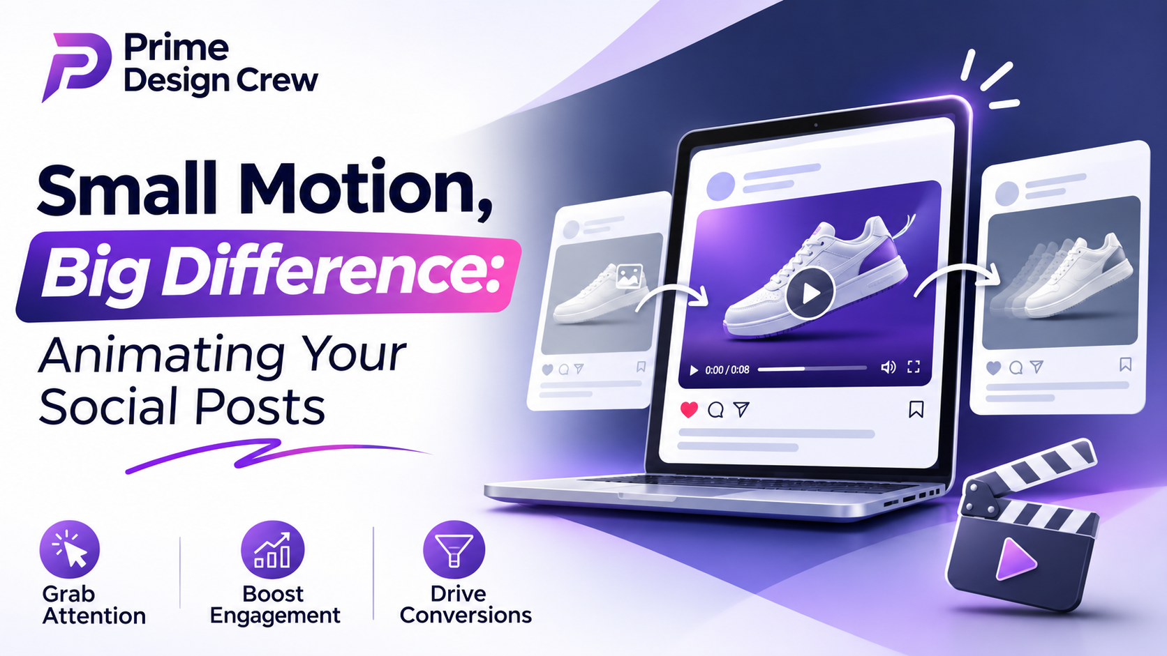
Write down something that brought your attention to a stop. Odds are it was moving. Or perhaps a coffee cup with steam rising from it, or a bar chart that is building up the bars one at a time, or a little cartoon pencil scribbling out a headline. Nothing fancy. Just motion.
The surprising thing about it is the little bit of it that is required now. There's no need for a studio or team. There are no restrictions on who can make a moving thing, just a few minutes of spare time and an idea. Not quite a feature film and not necessarily a film.
Why Movement Works
We are designed to see things in motion. It's an old survival reflex, and neither does a feed of identical rectangles turn it off. A little animation goes a long way in telling the eye to look here before the brain has determined anything and that little pause often is all a post requires.
Motion also has a few quieter jobs as well. It describes things very quickly: a ten-second diagram that assembles itself can tell what three paragraphs cannot. It's also easier to remember too, because they remember moving images over a still image.
It's also great for standing out, since there are still a lot of accounts that are using plain photos and text cards. A simple headline that slides in for instance looks a little more alive. There's also the mood of pace, color and bounce; your posts begin to sound like yours before you even put your finger to the page.
What Separates the Good Ones
There are many animations that fail, typically for one of the same few reasons. The ones that end up here do get some of the basics comparatively right.
Short wins. The magic number for most posts is between 5-15 seconds. People immediately make their decision on whether to stay or leave and you need to get to the point in the first beat, not the logo.
Assume that the sound is turned off. There are many people who scroll whilst the sound is off, on train, you're waiting in a waiting room, by someone who's sleeping. If your message requires audio only, provide captions or words on screen.
Place the best stuff towards the front. The view goes first when it comes to the best movement, the punchiest line, whatever. Everyone else will not see it if it's saved for the end.
If possible, let it "loop. When the animation ends where it began, it is seamless and people tend to watch it a second time without realizing.
Be aware of the shape of the screen. Vertical 9:16 is typically a good format for stories and short video; square or 4:5 is generally best in a regular feed. Create in the location it will actually be displayed in, rather than the location you are editing in.
Starting From Zero
If you feel like you're taking in a ton of software, it's not that much. There are lots of tools out there that will take care of the tricky stuff. You can use an AI animation maker for social media to tell it what you want or just input some images, and it will handle motion paths, timing and export sizes. That leaves you with a thought in your mind instead of thinking about keyframes.
One way to start that is roughly:
1. Pick one goal. It's not about announcing, teaching or entertaining but only one.
2. Say it in a sentence. If it will not fit in one line, cut it off.
3. Keep the style simple. Animate well, with a clean typeface, and bold colors work well on a small screen.
4. Create a “bad” first draft. Polish can wait.
5. Check it on your phone at real size. If you can't see it clearly - squint, or if it passes quickly, then fix that.
The potential for mistakes is great.
The mistake that everyone makes is putting too much in. If six things are going on at the same time, nobody's going to see it; so have one thing lead the way. The second pitfall is speed: something that seems fast on a large screen may be a blur on a mobile device. Be consistent with your fonts, colors and the type of movement you make, and the posts in your feed will look like one feed, and not five. And instruct people what to do next. A lovely animation with no follow, click or share prompt is a missed chance.
Examining for Effectiveness
Once you post, ignore the amount of likes. Watch time, shares, saves and comments reveal either a person's caring or lack thereof. The opening should be improved if the majority of viewers are leaving early, at around the three-second mark. If they want to remain till the end and pass it on, you have something to repeat.
Think of each post as a mini-experiment. Make one change at a time, such as length, colors, or the first second(s) and then keep what they like.
One Last Thing
I guess animation was once a niche area. It's now more like a regular form of communication and the key obstacle is just getting started. The most important thing is to have a clear idea, but also a bit of respect for how people do scroll, and also the patience to try out things which you know won't turn out the first time.
So start small. Keep it simple. Let it move.Write down something that brought your attention to a stop. Odds are it was moving. Or perhaps a coffee cup with steam rising from it, or a bar chart that is building up the bars one at a time, or a little cartoon pencil scribbling out a headline. Nothing fancy. Just motion.
The surprising thing about it is the little bit of it that is required now. There's no need for a studio or team. There are no restrictions on who can make a moving thing, just a few minutes of spare time and an idea. Not quite a feature film and not necessarily a film.
Why Movement Works
We are designed to see things in motion. It's an old survival reflex, and neither does a feed of identical rectangles turn it off. A little animation goes a long way in telling the eye to look here before the brain has determined anything and that little pause often is all a post requires.
Motion also has a few quieter jobs as well. It describes things very quickly: a ten-second diagram that assembles itself can tell what three paragraphs cannot. It's also easier to remember too, because they remember moving images over a still image.
It's also great for standing out, since there are still a lot of accounts that are using plain photos and text cards. A simple headline that slides in for instance looks a little more alive. There's also the mood of pace, color and bounce; your posts begin to sound like yours before you even put your finger to the page.
What Separates the Good Ones
There are many animations that fail, typically for one of the same few reasons. The ones that end up here do get some of the basics comparatively right.
Short wins. The magic number for most posts is between 5-15 seconds. People immediately make their decision on whether to stay or leave and you need to get to the point in the first beat, not the logo.
Assume that the sound is turned off. There are many people who scroll whilst the sound is off, on train, you're waiting in a waiting room, by someone who's sleeping. If your message requires audio only, provide captions or words on screen.
Place the best stuff towards the front. The view goes first when it comes to the best movement, the punchiest line, whatever. Everyone else will not see it if it's saved for the end.
If possible, let it "loop. When the animation ends where it began, it is seamless and people tend to watch it a second time without realizing.
Be aware of the shape of the screen. Vertical 9:16 is typically a good format for stories and short video; square or 4:5 is generally best in a regular feed. Create in the location it will actually be displayed in, rather than the location you are editing in.
Starting From Zero
If you feel like you're taking in a ton of software, it's not that much. There are lots of tools out there that will take care of the tricky stuff. You can use an AI animation maker for social media to tell it what you want or just input some images, and it will handle motion paths, timing and export sizes. That leaves you with a thought in your mind instead of thinking about keyframes.
One way to start that is roughly:
1. Pick one goal. It's not about announcing, teaching or entertaining but only one.
2. Say it in a sentence. If it will not fit in one line, cut it off.
3. Keep the style simple. Animate well, with a clean typeface, and bold colors work well on a small screen.
4. Create a “bad” first draft. Polish can wait.
5. Check it on your phone at real size. If you can't see it clearly - squint, or if it passes quickly, then fix that.
The potential for mistakes is great.
The mistake that everyone makes is putting too much in. If six things are going on at the same time, nobody's going to see it; so have one thing lead the way. The second pitfall is speed: something that seems fast on a large screen may be a blur on a mobile device. Be consistent with your fonts, colors and the type of movement you make, and the posts in your feed will look like one feed, and not five. And instruct people what to do next. A lovely animation with no follow, click or share prompt is a missed chance.
Examining for Effectiveness
Once you post, ignore the amount of likes. Watch time, shares, saves and comments reveal either a person's caring or lack thereof. The opening should be improved if the majority of viewers are leaving early, at around the three-second mark. If they want to remain till the end and pass it on, you have something to repeat.
Think of each post as a mini-experiment. Make one change at a time, such as length, colors, or the first second(s) and then keep what they like.
One Last Thing
I guess animation was once a niche area. It's now more like a regular form of communication and the key obstacle is just getting started. The most important thing is to have a clear idea, but also a bit of respect for how people do scroll, and also the patience to try out things which you know won't turn out the first time.
So start small. Keep it simple. Let it move.